

Your onboarding completion rate is 85%. Your welcome email open rate is 62%. Your setup wizard shows 4 out of 5 steps completed by most users. On paper, everything looks healthy.
But your 30-day retention is 34%. And your 90-day retention is 19%.
Something doesn’t add up. If onboarding is going so well, why are users leaving?
The answer is almost always the same: your onboarding is optimized for completion, not for activation. You’ve built a flow that users can get through easily — but getting through it doesn’t mean they experienced value. They completed the steps. They just didn’t feel the benefit.
Here are five specific mistakes that create this gap between impressive onboarding metrics and disappointing retention.
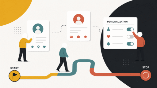
Mistake 1: Measuring completion instead of activation
This is the root cause that enables all the others. When “onboarding completion” is your north star metric, you naturally design the flow to be easy to complete. Fewer steps, simpler inputs, skip buttons everywhere. The completion rate goes up, the team celebrates, and nobody notices that completion doesn’t correlate with retention.
Completion is a process metric. Activation is an outcome metric. A user who completed 3 out of 5 setup steps but sent their first campaign is more valuable than a user who completed all 5 steps but never used the product for its intended purpose.
The fix is simple but requires discipline: define your activation moment (the single action that predicts retention), and make that your onboarding metric. If your activation rate is climbing, onboarding is working — regardless of what the completion numbers say. If completion is high but activation is flat, you’ve built a pleasant process that doesn’t lead anywhere meaningful.
Mistake 2: Letting users skip the hard part
In the pursuit of frictionless onboarding, many teams add “skip” or “do this later” options to every setup step. The logic feels sound: don’t force users to do things they’re not ready for. Respect their autonomy.
But the “hard part” is often the part that delivers value. Connecting a data source. Inviting a teammate. Importing their existing content. Setting up an integration. These steps require effort — and that’s precisely why they create activation. The effort produces a result the user cares about.
When you let users skip these steps, you’re not removing friction. You’re removing the path to value. The user gets to an empty dashboard faster, sure — but an empty dashboard has no gravity. There’s nothing pulling them back.
This doesn’t mean you should force every step. It means you should distinguish between necessary friction (steps that create value) and unnecessary friction (steps that exist for your benefit, not the user’s). Keep the necessary friction and remove the unnecessary kind. If importing data is what makes the product useful, make the import process smoother — but don’t let them skip it.
Mistake 3: Front-loading information instead of value
Many onboarding flows start with a product tour — tooltips pointing at features, modal windows explaining capabilities, welcome screens listing everything the product can do. This feels thorough. It’s also backwards.
Imagine walking into a restaurant and being handed a 20-page menu with descriptions of every dish, a guide to the wine list, an explanation of the kitchen’s philosophy, and a map of the dining room. You’d leave.
Information overload during onboarding creates the illusion of helpfulness while actually delaying the moment the user gets to do something meaningful. Every tooltip they click through, every feature they learn about, every video they watch — all of it is time spent not using the product.
The fix is to invert the order. Let users do something first. Let them see a result. Then, once they have context and motivation, introduce the next feature or capability. Information that arrives after the user has a reason to care about it is absorbed. Information that arrives before is noise.
A one-step onboarding that gets the user to their first result in two minutes will outperform a five-step onboarding that takes fifteen minutes to teach them everything, every single time.
Mistake 4: Optimizing emails for opens instead of actions
Your welcome email has a 62% open rate. Excellent. But what percentage of openers clicked the CTA? And what percentage of clickers completed the action? And what percentage of completers came back the next day?
When you optimize onboarding emails for engagement metrics (open rate, click rate), you end up writing compelling subject lines and interesting content that don’t necessarily drive the behavior you need. A subject line like “10 things you didn’t know about [product]” might get opened, but it’s not driving activation. A subject line like “Your first report is one click away” might get opened less, but the opens that do happen are far more likely to produce action.
Every onboarding email should have one job: move the user to the next behavioral step. If you can’t name the specific action you want the reader to take, the email doesn’t belong in the onboarding sequence. Move it to your content newsletter or cut it entirely.
Track the full conversion chain from email send to activation, not just the email engagement metrics. A “boring” email with a 35% open rate that drives 15% activation is infinitely more valuable than an “exciting” email with a 60% open rate that drives 3% activation.
Mistake 5: Treating all new users as the same audience
A marketing manager at a 50-person company and a solo freelancer signed up for the same product on the same day. They have completely different needs, different technical abilities, different definitions of value, and different timelines for activation. But most onboarding flows treat them identically.
This one-size-fits-all approach guarantees that onboarding is slightly wrong for everyone. The power user finds it patronizing. The novice finds it too fast. The enterprise buyer doesn’t see their use case reflected. The small business owner doesn’t see theirs.
The fix starts with a single question during signup: “What are you hoping to accomplish?” or “Which best describes your role?” This one data point lets you branch the entire onboarding experience — different welcome messages, different activation targets, different email sequences, different in-app guidance.
You don’t need ten segments. Three is usually enough: the beginner who needs guidance, the intermediate user who needs a clear path to value, and the advanced user who needs you to get out of the way.
Even a rough segmentation that’s approximately right for each group will outperform a polished flow that’s generically wrong for everyone.
The common thread
All five mistakes share the same root: optimizing for the wrong thing. Completion instead of activation. Opens instead of actions. Smoothness instead of value. Volume instead of quality.
The teams that convert best are the ones that are willing to sacrifice vanity metrics for real outcomes. They’ll accept a lower completion rate if it means more users reach activation. They’ll tolerate a longer setup process if it produces genuine first-time value. They’ll send fewer emails if it means every email drives meaningful behavior.
It takes courage to report lower numbers on the metrics everyone’s used to watching. But it takes more courage to watch your retention flatline while pretending your onboarding is working.
Look at the gap between your onboarding metrics and your retention metrics. If it’s wide, one of these five mistakes is almost certainly the cause.